Dining Promotions
Food and beverage promotions, designed by Jen Leheny for Canberra Southern Cross Club.
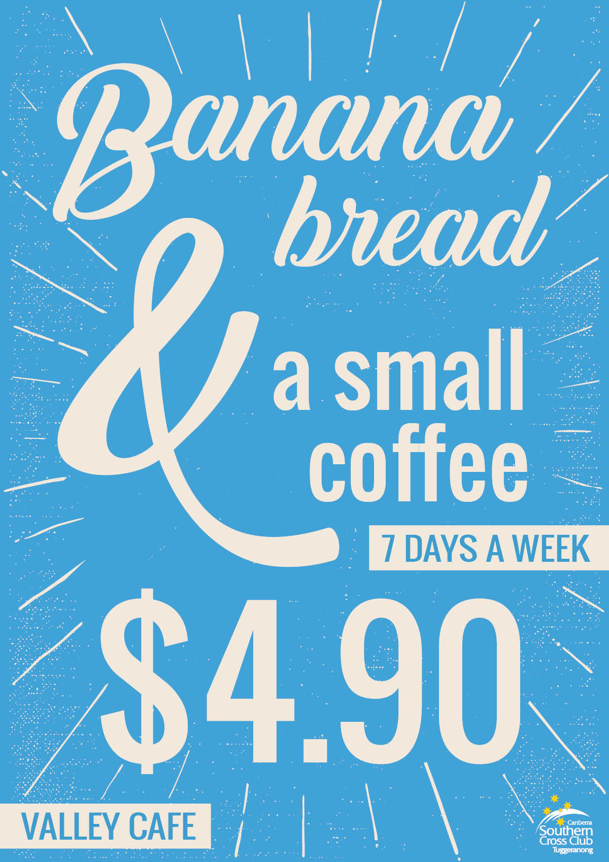
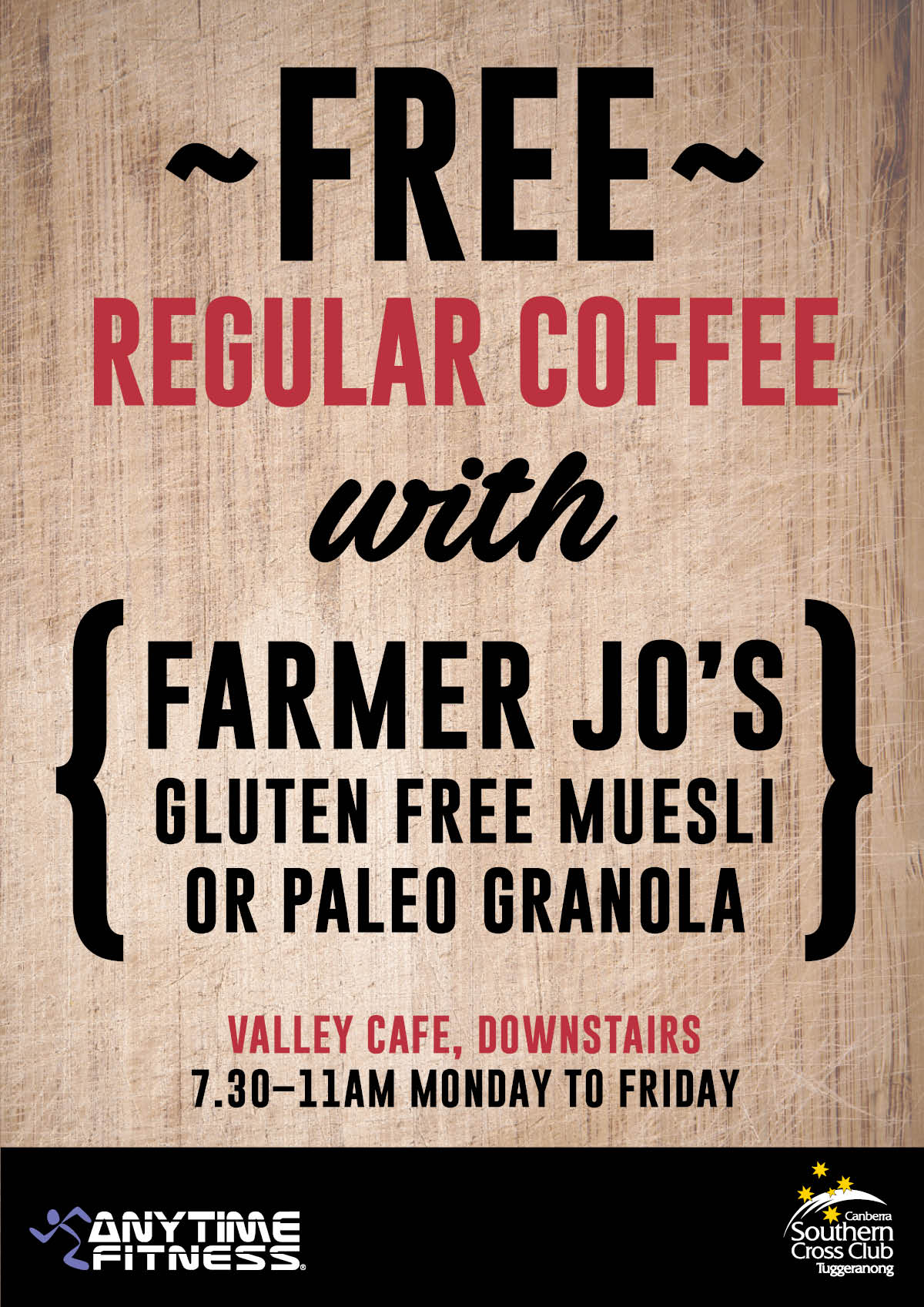
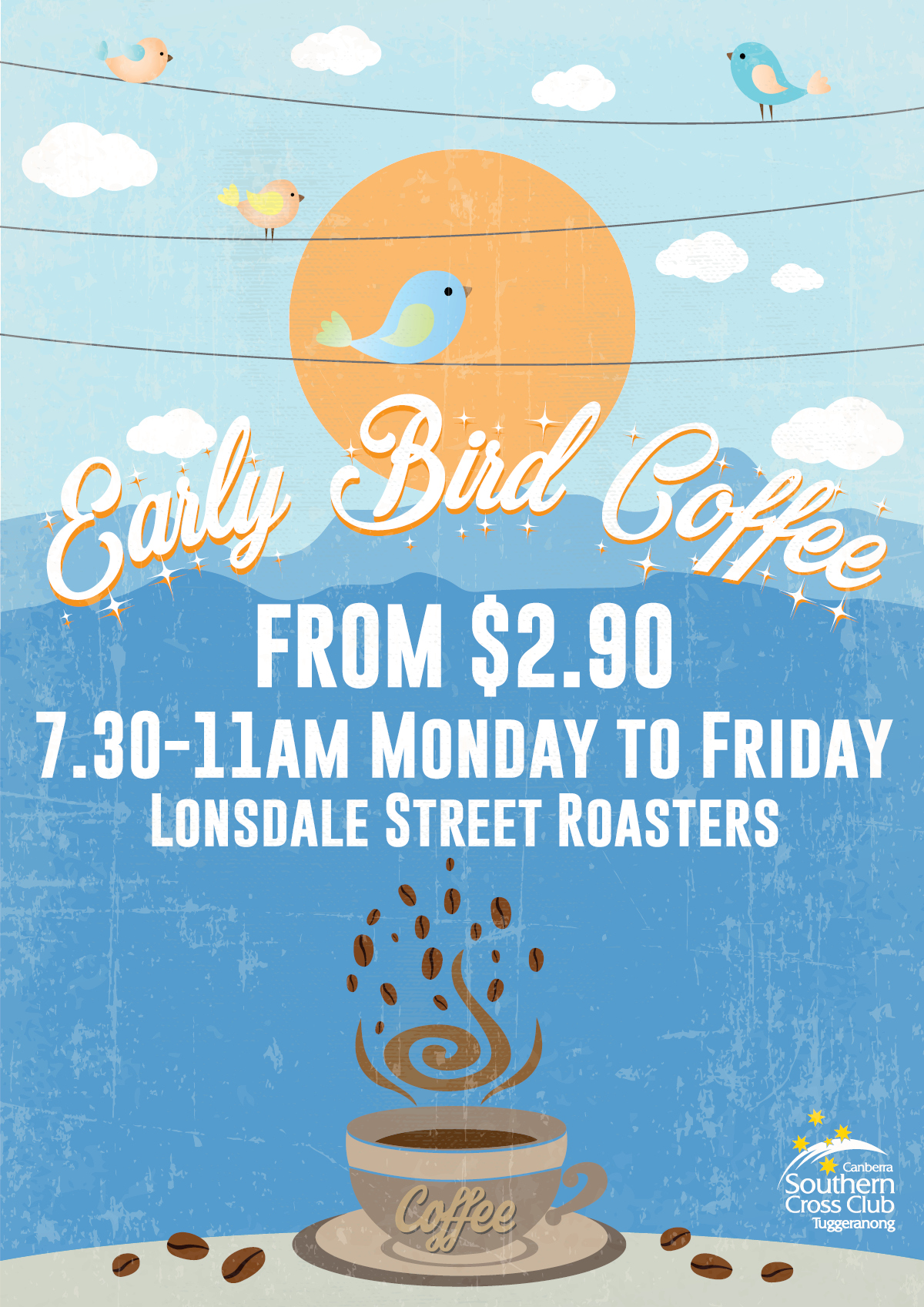
For the coffee promotions below, photos of the food and coffee offerings were not available so I used a typographic style, textures, and colour to grab attention. These promotions have been very successful.
As well as designing these posters, the designs were reworked into digital display screens, A-Frames, and point of sale graphics.
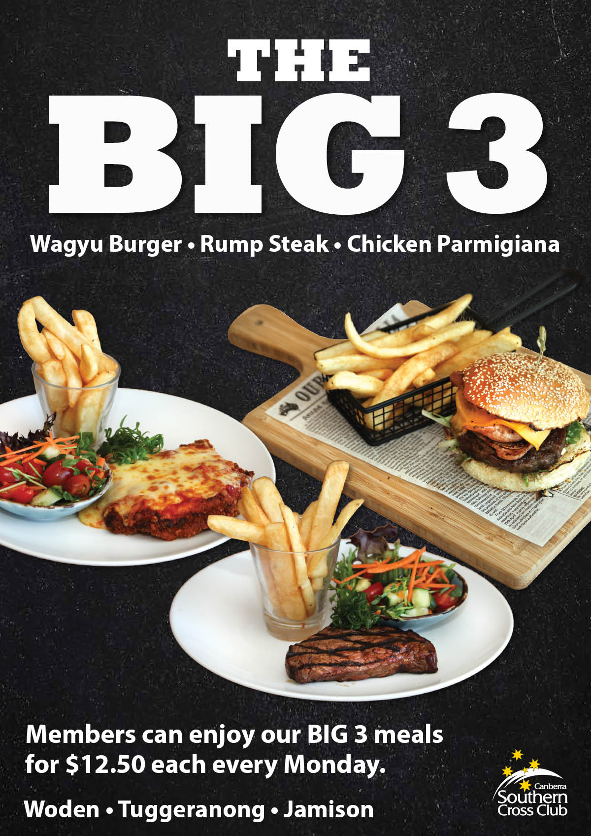
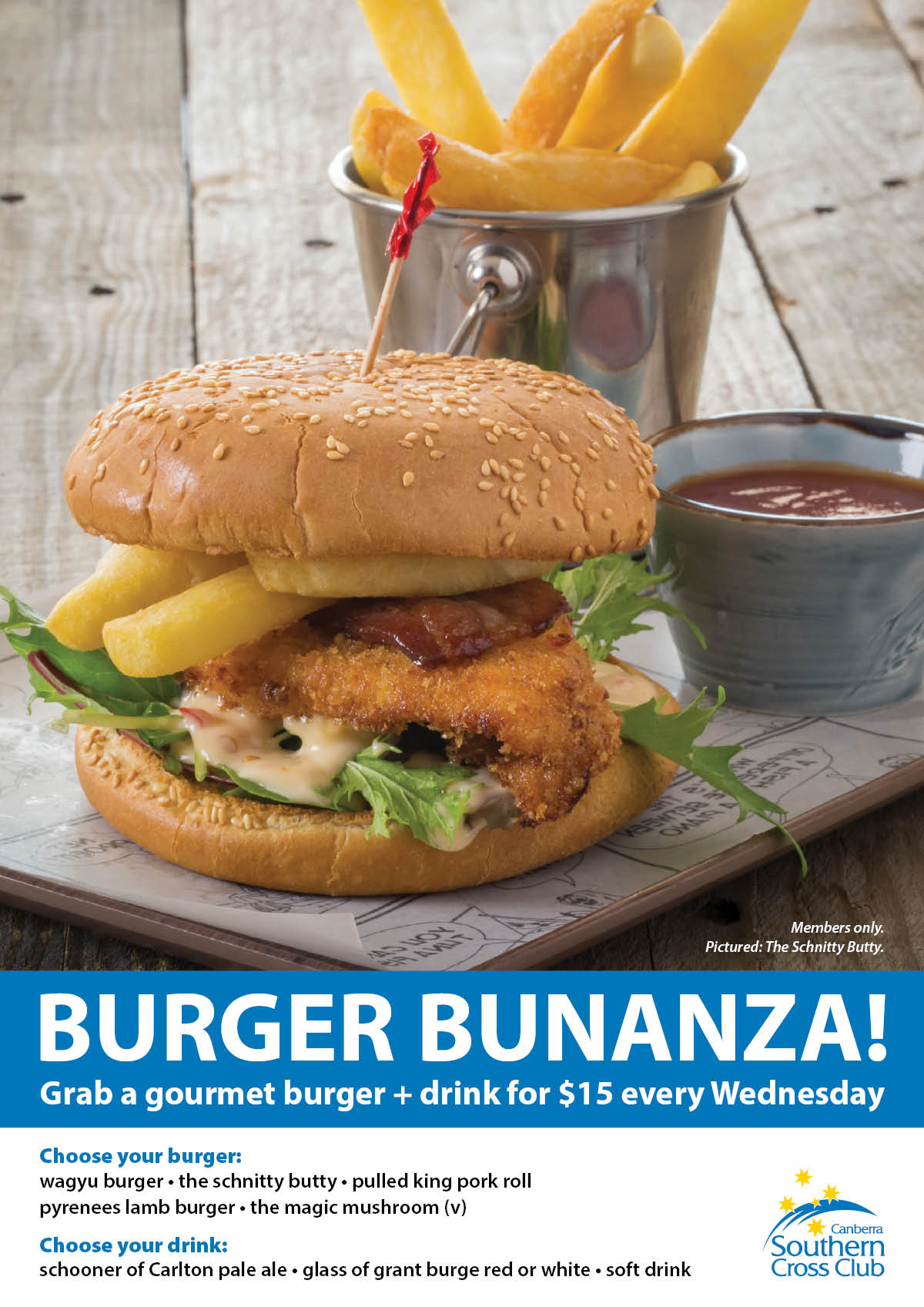
The promotions below used bold type with great photos to tell the story and tempt the tastebuds.
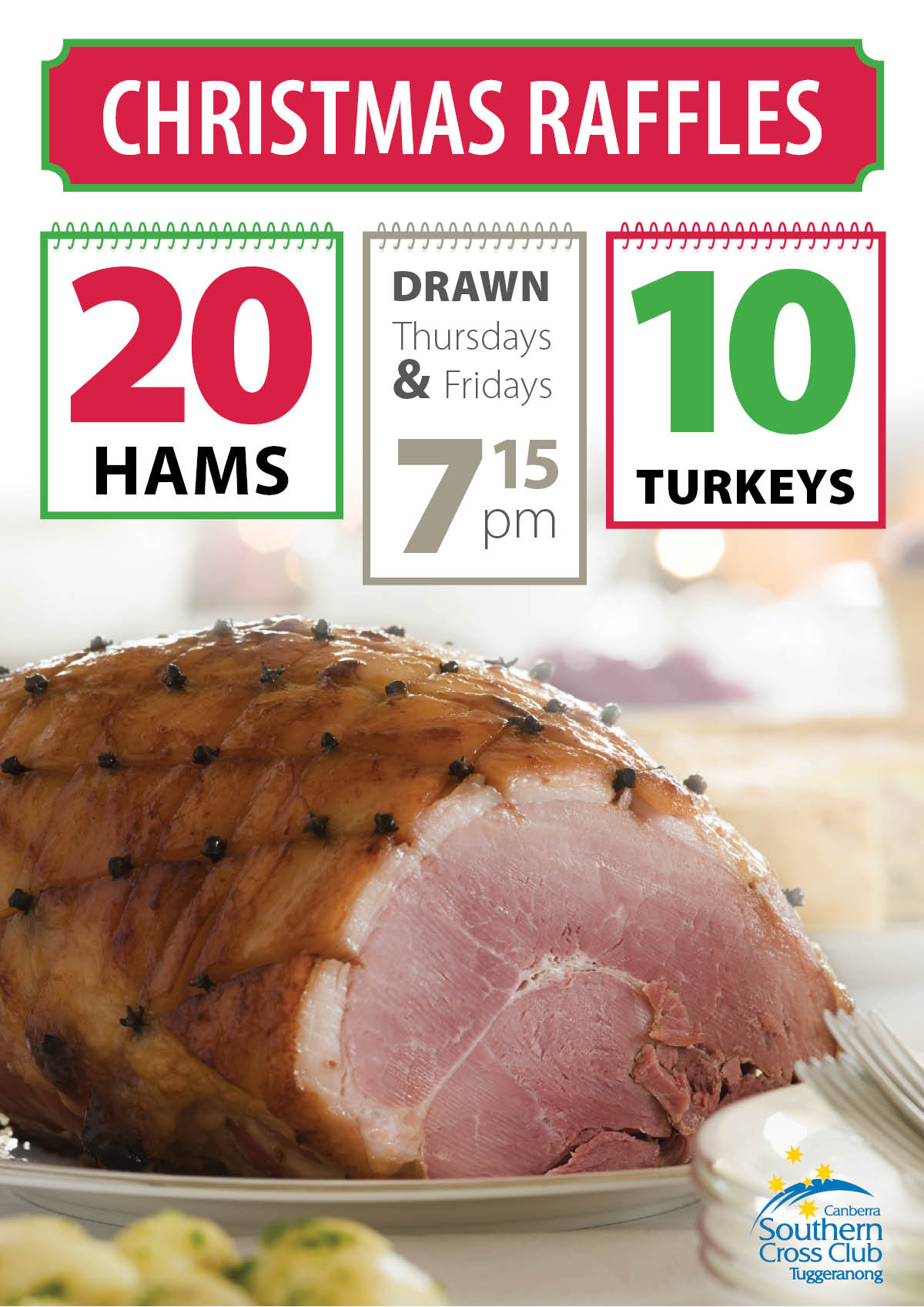
The photos for the first ‘The Big 3’ poster were supplied and then deep etched to cut them from their background, and composited together on a dark, textured background. The ‘Burger Bunanza’ in the middle shows the burger and chips with a simple but effective design. The ‘Christmas Raffles’ poster used a date flipper concept with large numbers for the three graphical elements towards the top of the design.
These designs were also reworked into DLs, digital display screens, and point of sale graphics.
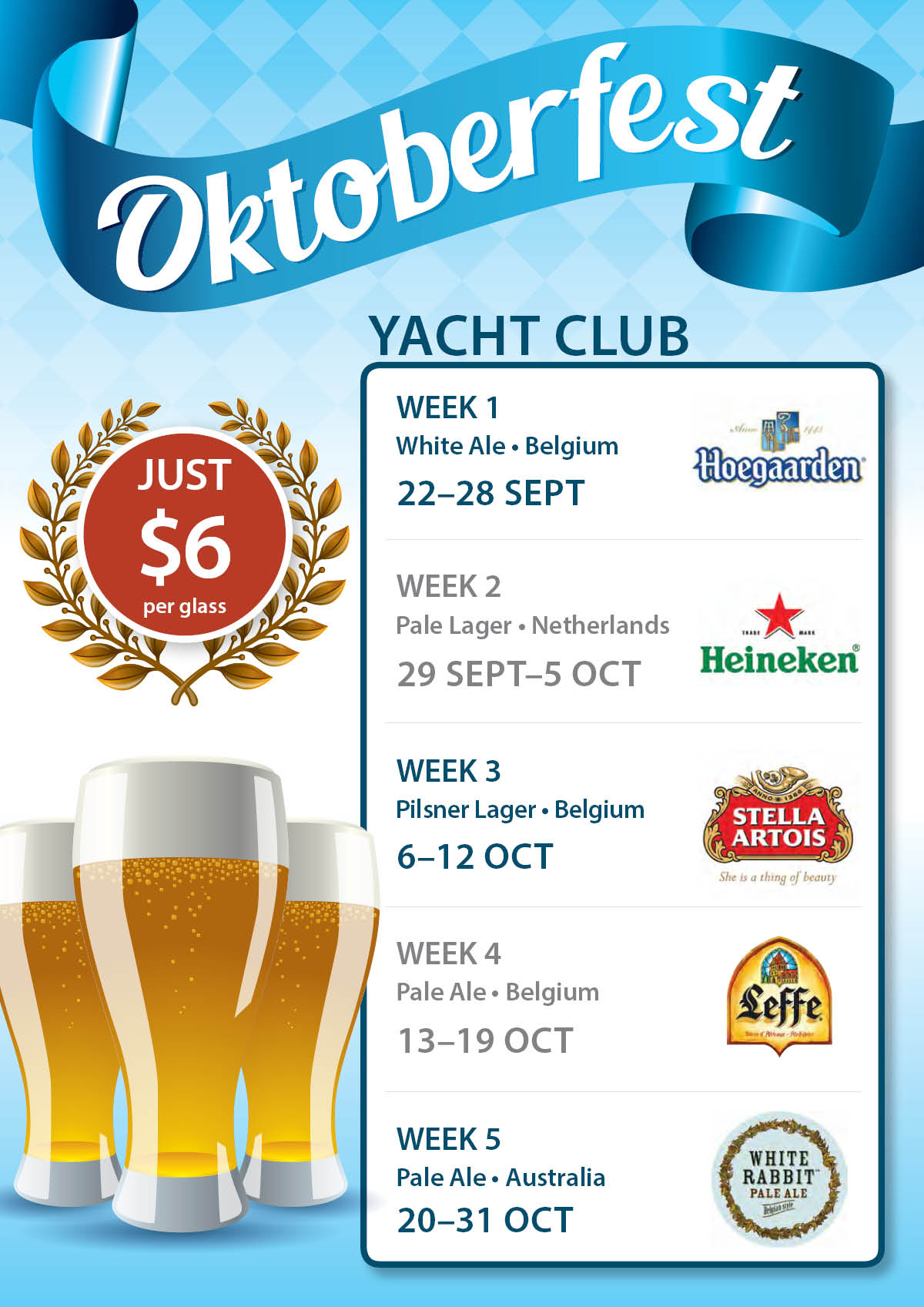
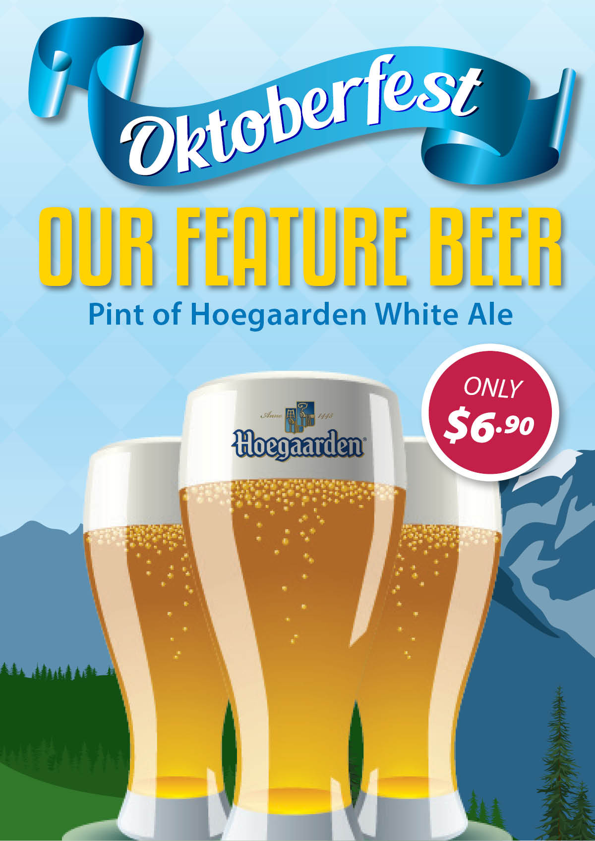
Posters to advertise Oktoberfest are shown below, with featured beers and an international competition. These were part of a larger campaign which ran throughout October. Stock images were used for many elements, with two staff members dressing up for a photo shoot to bring the campaign to life.
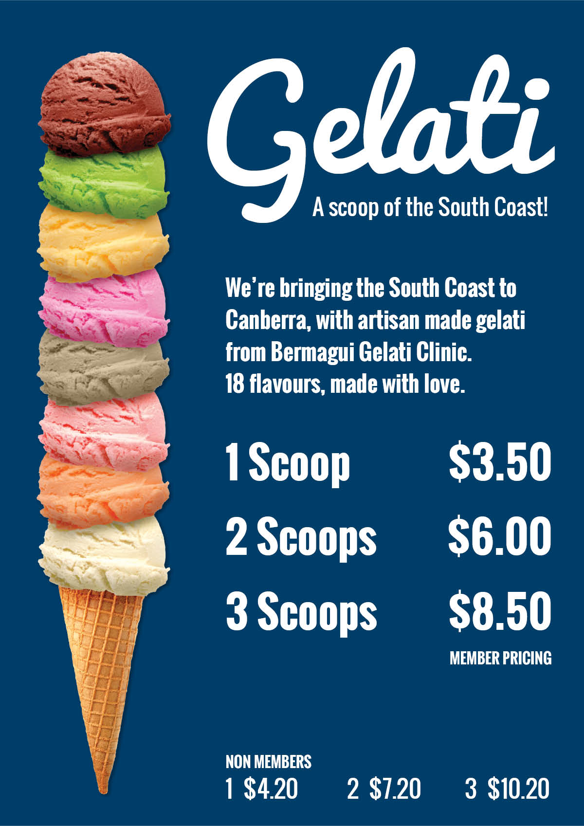
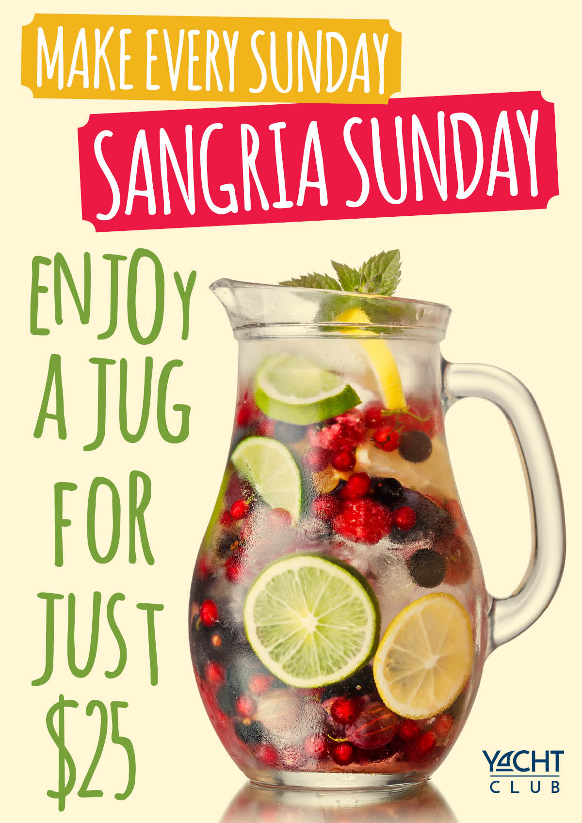
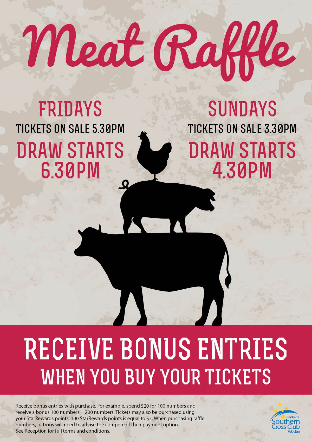
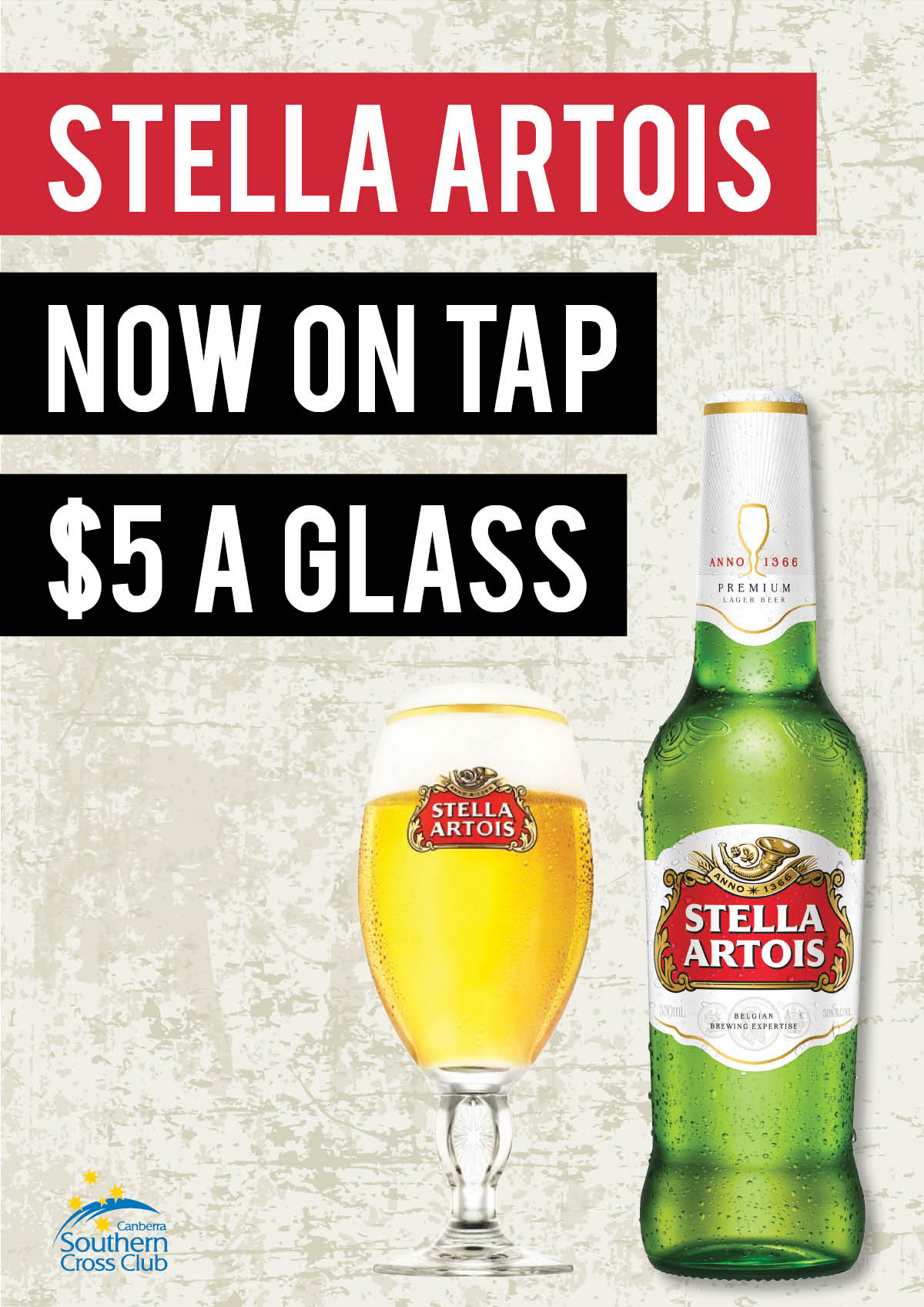
Below are more bright and bold eye catching poster designs. Careful choice of typographic styles and colour bring these designs to life in a fun and engaging way.
Food and beverage promotions, designed by Jen Leheny for Canberra Southern Cross Club.
