Design Principles Digital Art Photography Project
‘Design Principles’ digital art photogaphy project by Jen Leheny.
All images in the series feature Canberra model, Fiona Lieu, photographed in studio by Jen Leheny. Elements were made in Illustrator and Photoshop then the photo collage was put together in Photoshop. I made a few different images along the way (which I will show below) before settling on the final five to tell the story.
Each image has a colour palette of blue, pink, yellow and black – referencing the CMYK colour space (Cyan, Magenta, Yellow, Key/Black) and each image showcases one of these design principles: Line, Shape, Colour, Texture, and Tone/Value.
Design Principle: Line
Design Principle: Shape
Design Principle: Colour

Design Principle: Texture
Design Principle: Tone/Value
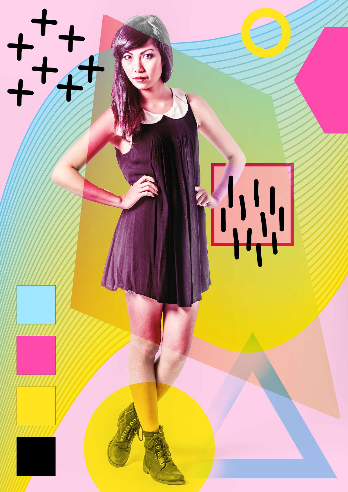
One of the most basic design elements is the line. Below you can see the progression of the images representing ‘Line’ with the final image to the far right. I was playing around to see what worked and didn’t work. I was going to include the flower and succulent images but they didn’t end up fitting the concept. I hand drew the crosses and lines pattern and made a waveform and some shapes in Illustrator to add texture and depth.
In the images below, lines have been used to add colour and depth to the piece. The wave form that appears in each piece (that curves from bottom left to top right of each image) was constructed in Illustrator using Blend mode to blend a blue and a yellow line to create an interesting shape. The circular elements in the top and bottom corner were also made in Illustrator and the other line elements were done in Photoshop. The pink, blue and yellow lines coming in from the edges have been layered over and under other elements to create a dynamic composition. Hand drawn lines and crosses were also included to add an organic feel. The model’s pose is also representative of a straight line.

Design Principle: Line (v1)

Design Principle: Line (v2)

Design Principle: Line (final)
The images below were created for the ‘Shape’ concept. I hand-drew the x-and-dot background and made it a repeating pattern within Illustrator. The succulent plant and beautiful flower (a pink Camellia) give a natural feel to the pieces, and mimic the circlular elements.
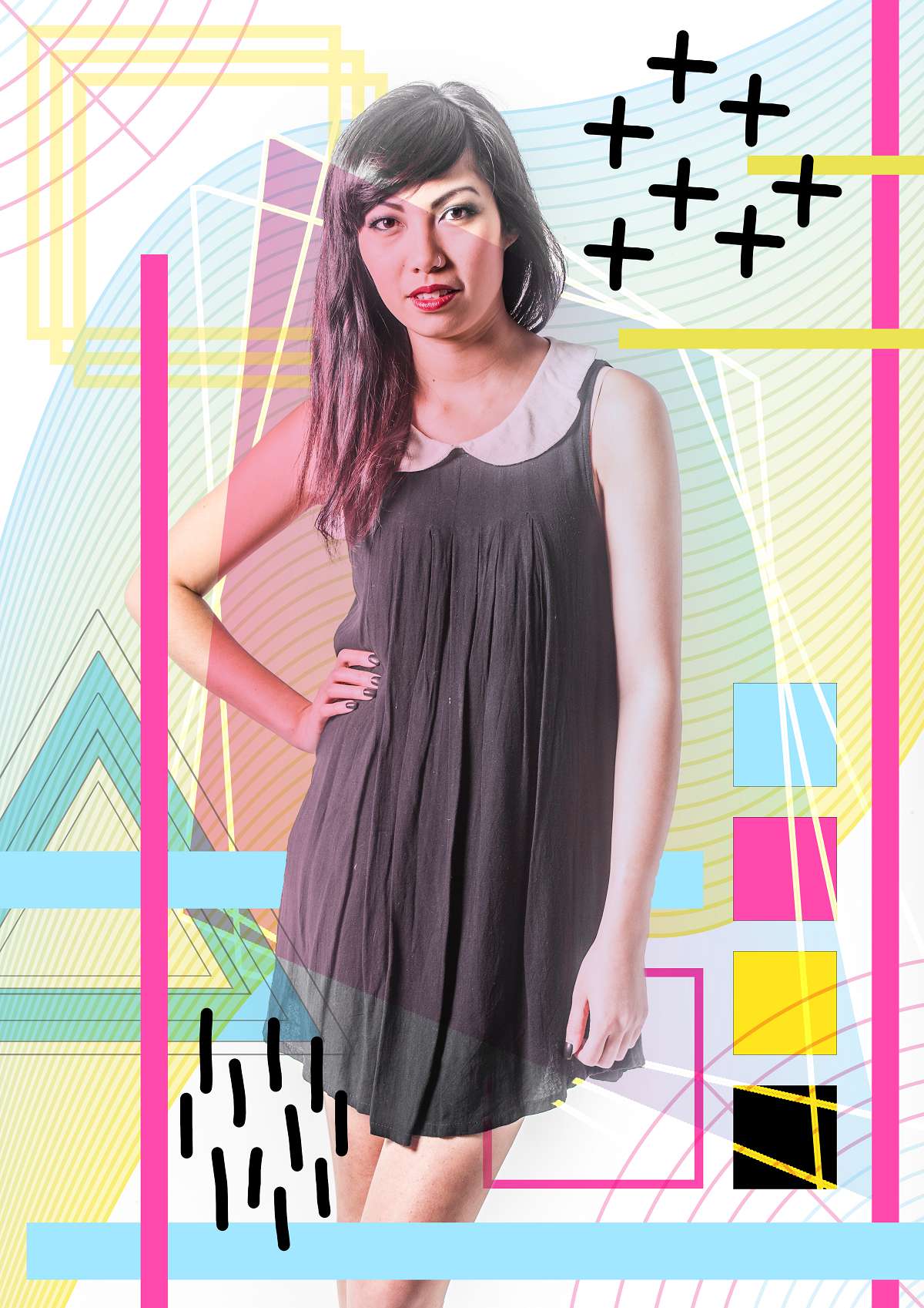
Shapes are the main design element in the second piece. Regular shapes such as the octogon, triangle, circle and square were made using Photoshop Shapes, and the model’s pose suggests a triangle within her folded leg. Squares can indicate stability, and circles often communicate unity and completeness and these are matched with other basic shapes. Elements from the first piece repeat, such as the wave form (this time in light grey) and the kite shape at the back has a gradient from pink at the top left, to blue at the bottom right. The small triangles reinforce the grey theme, and follow the wave form as it curves upwards, with the lines from the wave running through the four coloured squares.

Design Principle: Shape (v1)

Design Principle: Shape (v2)

Design Principle: Shape (final)
Next is ‘Colour’ and these two images were created for this theme. Like the other pieces, I layered colours, shapes, and textures behind and in front of each other for effect.
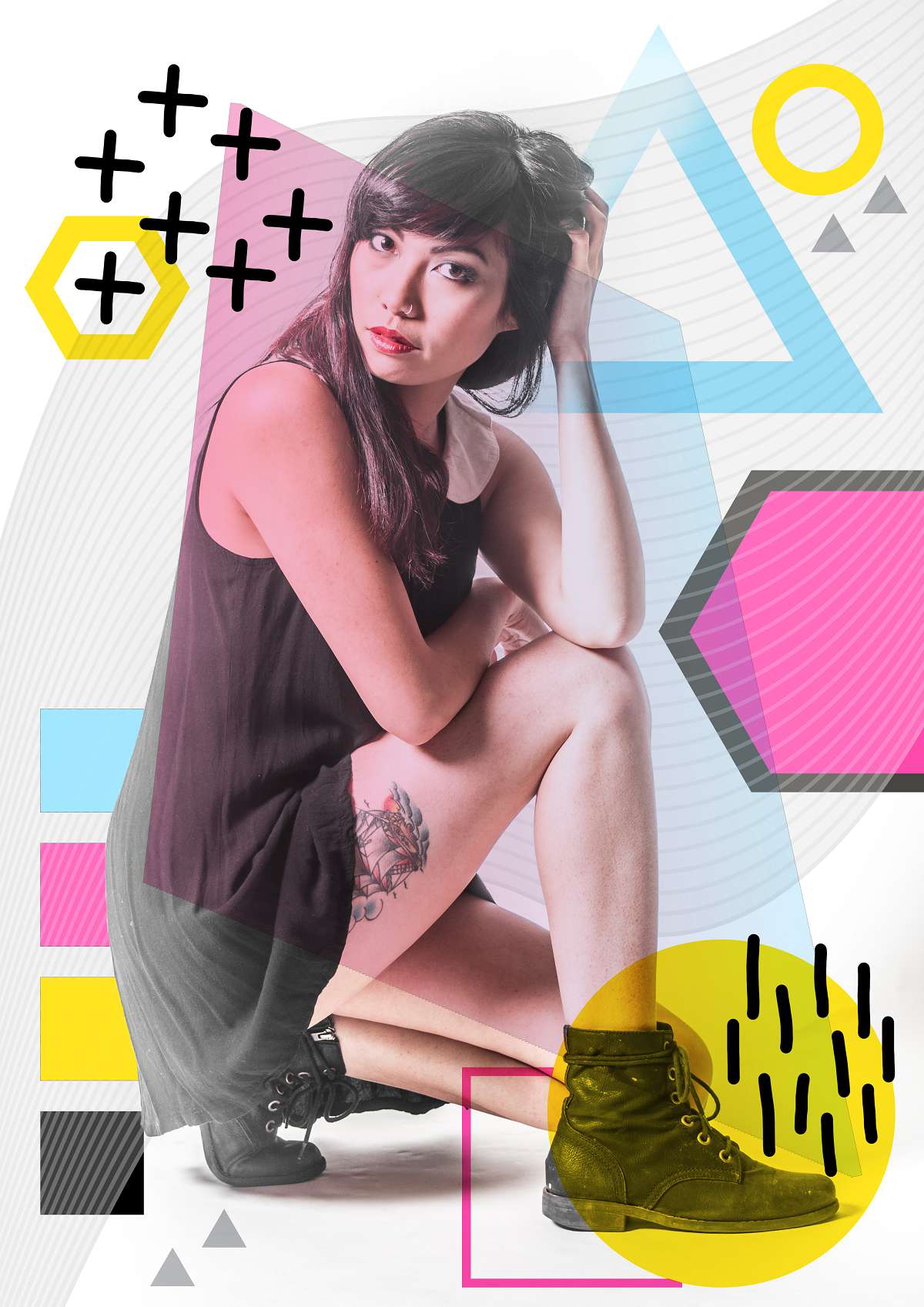
The finished ‘Colour’ art piece is shown below right. This piece celebrates bold colours with a light but bright pink background to offset the explosion of vivid colours and shapes. A vibrant version of the wave element ties the composition together and moves the eye from the bottom left through to the model and beyond to the top right. The kite brings a dark plum colour to the model using blending modes and her boots are circled with a bold yellow. The ring and hexagon shapes in the top right also sport a bold pink and yellow, and the CMYK style palette grounds the bottom left. The energetic colours layered and blended in this piece heighten the impact of the shapes and lines, and the striking composition brings focus to the model with her fearless pose.

Design Principle: Colour (v1)

Design Principle: Colour (v2)

Design Principle: Colour (final)
Next is ‘Texture’ with two progress images shown below. I really like all the images that I made along the way, even those that didn’t make the final piece. I especially liked the flower becoming part of the model’s hair in these two but decided against it for the final piece.
Bold and vibrant colours feature again in this piece, with a striking pose anchoring the composition. The repeating elements such as the square and circle on the left elbow, the organic black lines and crosses, and the textured triangle complement the symmetrical and bold pose of the model. The vibrant pinks from the last piece are this time textured with effects made in Illustrator, and a yellow honeycomb pattern was added in Photoshop. A blue to pink gradation is seen in the kite element, and the triangle and rough textures (created in Photoshop with the filter gallery) complete the look.

Design Principle: Texture (v1)

Design Principle: Texture (v2)

Design Principle: Texture (final)
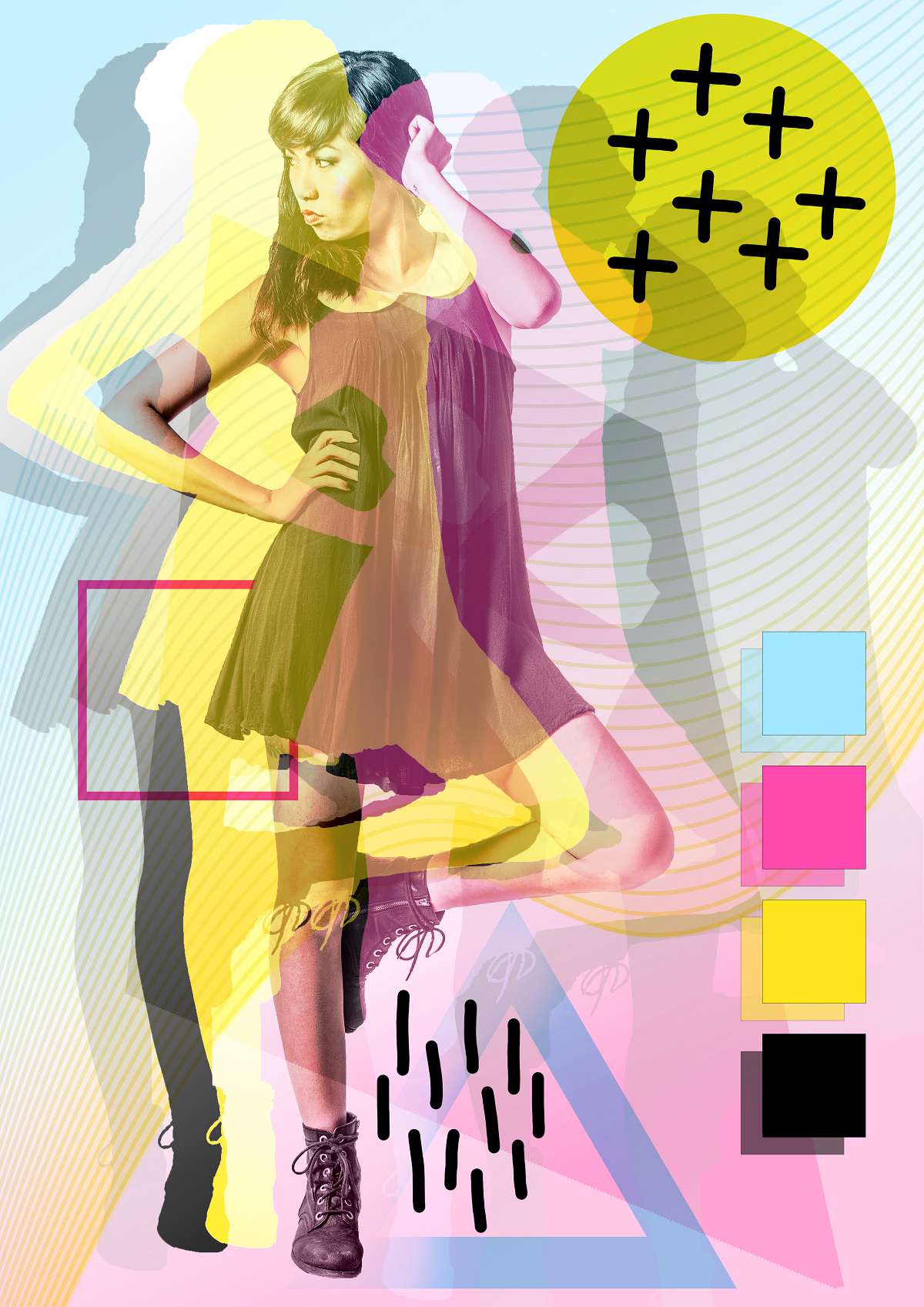
Finally, we have ‘Value/Tone’ which I have represented below, but again the first two images didn’t really fit the theme so I pushed myself to go further with the finished art piece for the ‘Value/Tone’ theme shown below right.
The colour palette again references the CMYK colour space, with the theme of value and tone in this piece. A more muted background colour of blue to pink gradient with the wave of blue to yellow lines (created with Illustrator’s Blend mode) runs in and behind the duplicated yellow, pink, light and dark grey model elements – superimposed to mimic a four colour separation of the offset printing process. The organic lines and crosses, pink outlined square, blue triangle and yellow circle tie the arrangement together. This piece is the fifth and final artwork in the series, together forming a cohesive body of work honouring five basic principles of graphic design and bringing them to life.

Design Principle: Value/Tone (v1)

Design Principle: Value/Tone (v2)

Design Principle: Value/Tone (final)
Below is the finished series, from L-R: Line, Shape, Colour, Texture, Tone/Value.
Design Principle: Line
Design Principle: Shape
Design Principle: Colour
Design Principle: Texture
Design Principle: Tone/Value
All photographs, editing, post production, and digital art works by Jen Leheny, with model Fiona Lieu.