
Queanbeyan Printing Museum Poster Series
Case Study: Queanbeyan Printing Museum Poster Series by Jen Leheny.
This was a university project for a Graphic Design Principles and History class that I completed as part of the Bachelor of Visual Communications degree at the University of Canberra. I was required to design a series of three posters to promote the Queanbeyan Printing Museum, located just outside of Canberra. We needed to follow the same ‘story’ throughout, connect the history of print to the modern day, and choose a 20th century design style for the art direction.
The finished poster series is shown below, along with a look at the design process.
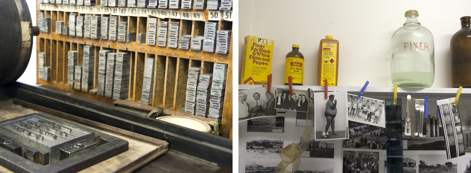
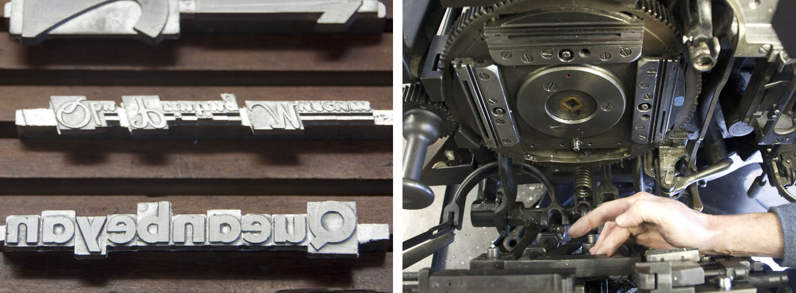
We began with a visit to the printing museum to see and learn about the history of the printing press, the process of typesetting, and learn about the production of the local newspaper (The Queanbeyan Age) that used to be printed there. I took some photos to inform my design decisions, to understand the space and how to promote it in poster form.
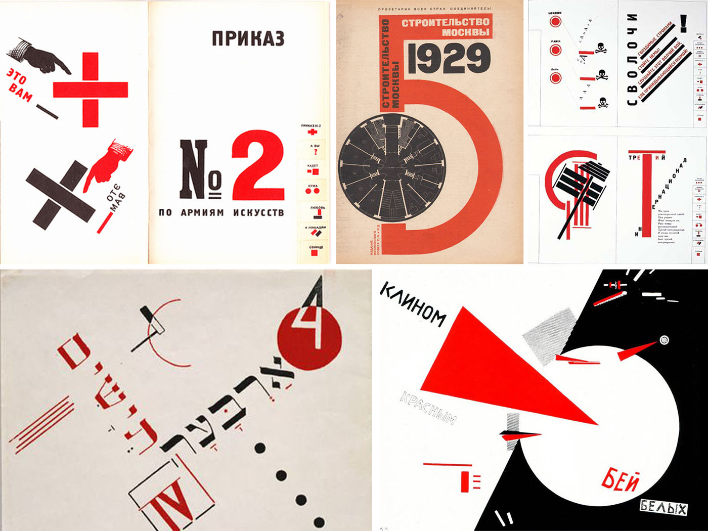
The design for this three poster suite was inspired by the Russian Constructivist movement (1919-1932), and especially work by El Lissitzky. I loved the simplicity of the black, white and red combination of colours, and the graphic nature of many of his posters and other designs.
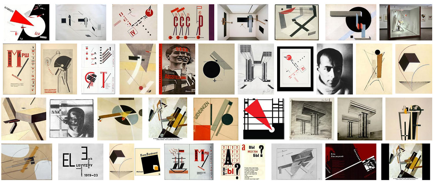
Constructivists explored many fields of design such as visual arts, architecture, industrial design, set design, furniture and fashion design, and cinema. However, it was their use of photography over painting, san serif typefaces over serif, their use of bold colours and montage, and the need for impact or legibility as the foundation of their graphic designs that set them apart from other movements.
Artists such as Alexande Rodtchenko, brothers Georgii, Vladamir Stenberg, Varvara Stepenova, El Lissitsky and Vladamir Mayakovsky played an important role in the development of graphic design and typography. At this time in Russia, there was a high level of illiteracy and the designers believed that it was important to base their designs on geometric shapes and to simplify the Cyrillic script in order to make their messages more accessible for their audience. Lissitzky used abstract forms that floated in space, primary colours and pure geometry in his work.
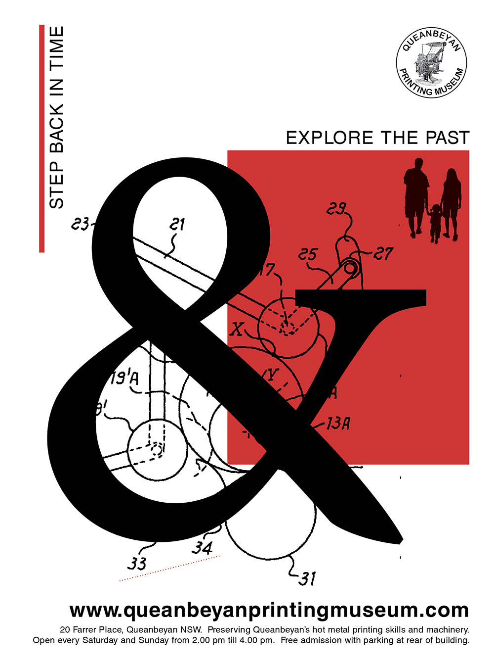
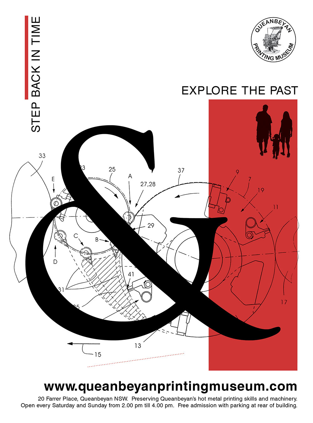
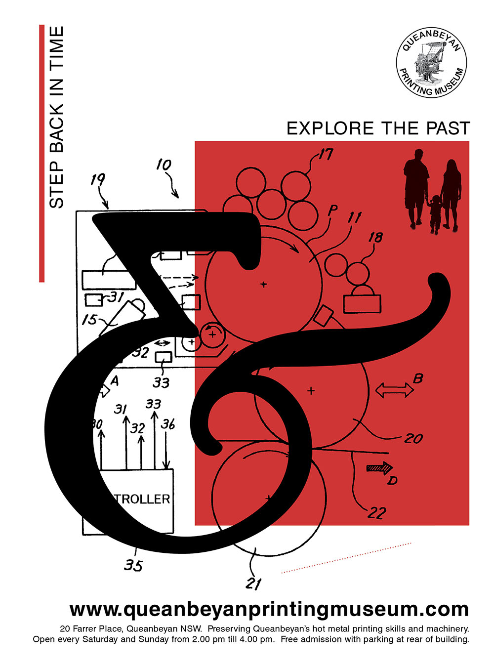
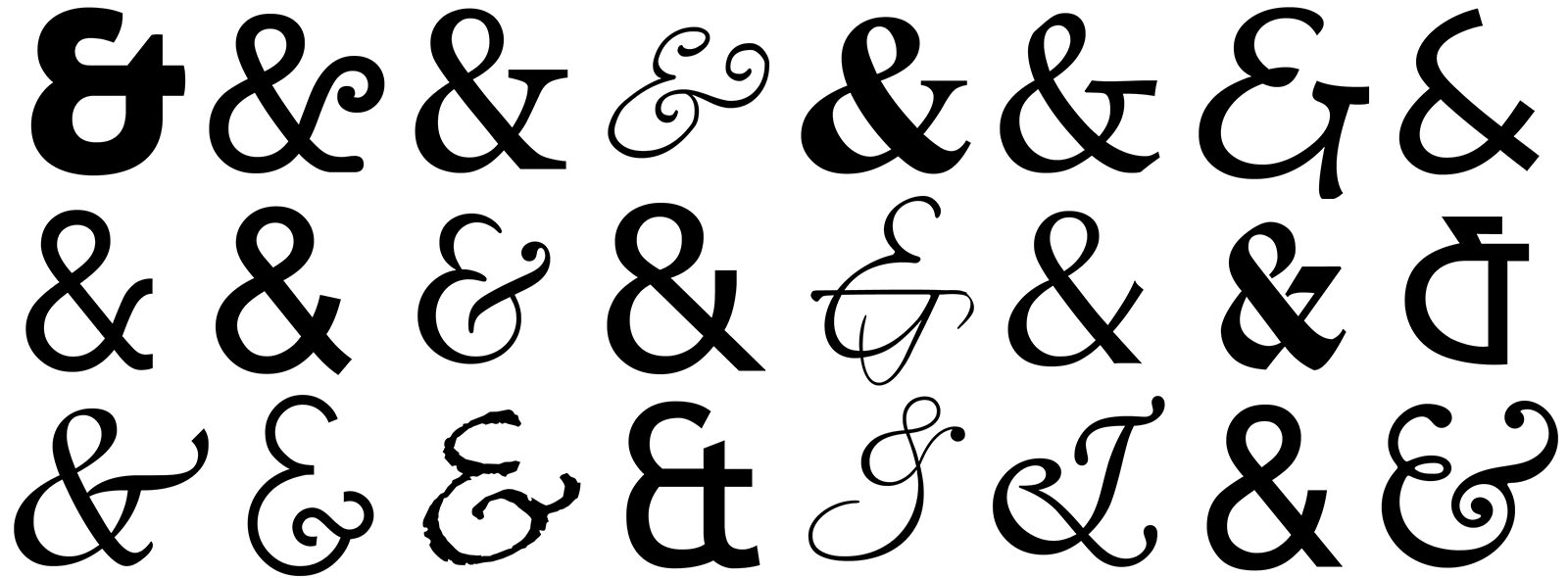
Once I had my style in mind, I decided to use the ampersand (&) as part of my design, as a nod to the typesetting and type forms used, and as the main graphical element in my poster series. I collected some examples from many different typefaces to see the large range of styles of ampersand and then chose three.
Next I gathered a selection of line drawings to represent the machinery and technical specifications of the printing presses. The line drawings, together with the red blocks and large ampersands, provides a strong graphic statement – well suited to a museum dedicated to remembering the old ways of producing newspaper and other items, and the inventions that led to a revolution in printing.
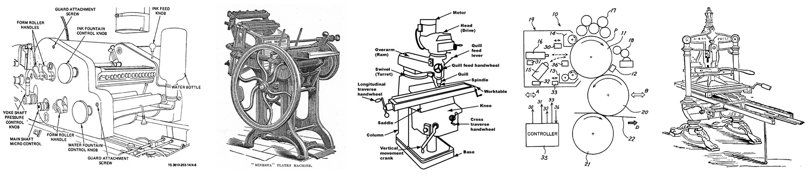
Next I put all the elements together. The words “Step back in time” (&) “Explore the Past” are linked together by the ampersand, forming a call to action. Behind the ampersand and the red rectangle is the line drawing of printing equipment, chosen for their round shapes which echo the roundness of the ampersand. The line drawings feature numbers and lines pointing to various elements which gives the piece a sense of movement and interest.
A silhouetted family is seen at the top of each red rectangle, underneath the call to action, putting the idea of a family day out in the mind of the consumer. The ampersand draws the eye in from the top left to the bottom right where the website, opening hours, and location of the museum sit.
I hope you enjoyed seeing behind the scenes to understand the process that went into designing a poster series for a university assignment in Graphic Design Principles and History at the University of Canberra.
Case Study: Queanbeyan Printing Museum Poster Series by Jen Leheny.